
Linkedin is the most popular professional networking site out there. With over 675 million members linkedin has been around for more than 16 years now.

DESIGN PROCESS

DESIGN CHALLENGE
Before diving into the redesign, it was essential to understand Linkedin and the features associated with the platform completely, which included the premium account. I will be analyzing some of the important features of Linkedin based on Usability Heuristics for User Interface Design in this case study.
Why Redesign?
-
Linkedin is starting to show its age - Linkedin has given people the right type of consistency to the user experience that people needed - and the right combination of features that made it perfect for professional networking. But, the UI is starting to get outdated - It needs a fresher look.
-
Redundancy of content - Information displayed on the website has equal importance, it’s important to group content in a way that the user’s focus can be directed towards the important features of the website.
-
Back button fatigue - Every time the user clicks on any of the buttons, they are directed to a new page. Going back to the previous page by clicking on the back button causes back button fatigue.
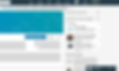
CURRENT STATE ANALYSIS
Home Page:

-
Missing Visual Hierarchy - When processing the page, elements of the top navbar such as Home, Network, Jobs, and Messaging are given the same importance - but, Linkedin is clearly a professional networking site focused on employment-oriented service.
-
Also, on the left-hand side of the page - The user’s profile is given the same importance as the information about their pages.
-
Irrelevant Content - Generating information relevant to the user - On the right side of the homepage, generic information such as daily news is displayed.
Profile:

-
Decreased Visibility - Important information relevant to the user’s profile is hidden due to vertical scrolling. User’s photo, cover photo, and headline take up more space than necessary.
-
Different profile and public URL page - Edit profile page is organized differently from the page that is displayed to the public. This inconsistency can result in confusion that in turn can cause mistakes.
-
Disorganization of information on the page - Restrictions when it comes to organizing user’s information displayed on the page is a UX flaw that cannot be ignored. For example: When adding projects last-come-first out is used to display the projects - The project that is added at the end is displayed.
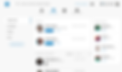
Network:

-
Redundant tabs - There are way too many tabs on the left-hand side of the page that are redundant. For example: A separate tab for Teammates, Contacts, and Hashtag.
-
Inconsistent tabs - Relevant tabs are not grouped together - Tabs such as Connections, and Teammates are used to displaying information related to the network, and tab such as contacts is an action taken by the users to import their contacts. Importance of certain tabs gets lost because of this inconsistency.
-
Overused white space - Although, using white space is good - overuse of it results in losing information over “beautification” of the page - something that is evident in this page.
INITIAL SKETCHES


WIREFRAMES
Homepage:

-
Improved Visual Hierarchy - Firstly, it was important to focus on the global header/navigation so the best decision was to have two navigation bars - a primary one and a secondary one. Primary Navbar - Home, Network, Jobs, E-learning. Secondary Navbar - Dashboard, Message, Notification, Saved Posts, Profile.
Why? - It helped in scaling back on the visual noise created by all the competing elements in the header itself.
- Important features are easily accessible to the users.
- It also helped in exposing features that are hidden or not frequently used by users. For example: If Linkedin wants to promote E-Learning in order to provide courses to their users, E-Learning can be placed in the primary navbar (As shown in the wireframe).
-
Dynamic relevant Content - Linkedin mainly focuses on employment-oriented services. Depending on the date captured from the users, dynamic content can be generated and displayed to the users.
Why? Displaying relevant content to the user can provide a more personalized experience for the user, which further improves the user experience of the site.
Profile:

-
Improved Visibility - Utilising the white space on the profile page to display more information.
Why? Users can view important information without having to scroll down too much.
-
Similar profile and public URL page - Instead of having two completely different pages, information is organised in one page.
Why? - Mistakes can be avoided when the user can edit information based on how it will be displayed to anyone that would be viewing the user’s profile.
- Improved mapping of information
-
Better organization of information on the page - The user is given the flexibility to move the projects horizontally.
Why? - Flexibility to change the order of projects will avoid confusion which in turn reduces frustration when users organize their projects.
- Improves personalization of the site.
Network:

-
Conciseness - Grouping similar tab elements together to avoid overcrowding of information.
Why? Avoiding redundancy will reduce confusion and increase visibility. Every extra unit of information in a dialogue competes with the relevant units of information and diminishes their relative visibility. ( 10 Usability Heuristics for User Interface Design)
MOCKUPS
Here are the final redesigned Linkedin pages.


And Voila! Here’s the dark mode of it...


CURRENT LINKEDIN VS MY REDESIGN
-
Aesthetic and minimalist design - Redesigned Linkedin has a fresher look compared to the older version. Also, most of the noise is reduced by removing redundant information
-
Grouped similar information - There is a visual hierarchy in place that allows users to navigate the site efficiently.
-
Back button fatigue - Instead of having to click the back button, users can switch between tabs which is an easier way to “undo” and gives more helps to recover from errors and thus explore features with more freedom.


CONCLUSION
All-in-all, the three redesigned screens were made without any access to any Linkedin internal information and thus is not flawless. However, by using Usability Heuristics for User Interface Design principles, I was able to tackle some UX flaws of Linkedin. A round of usability testing will help to fine-tune the designs discussed in this case study.
The entire design took 2 days to complete. And, while not all minor design elements are covered in this case study, important ones are taken care of. By applying similar principles, and by doing more UX research, I believe I can come up with a complete redesign in the near future.